Creative Current
The
Why the Colors You Choose Are Either Building Your Brand or Quietly Undermining It
Let me paint you a picture. (Pun totally intended.)
You’re scrolling Instagram and you stop on a post. You don’t really know why. It’s a product that’s similar to ten others you’ve seen and the offer isn’t wildly different. But something about it stopped the scroll.
Nine times out of ten? It was the color.
Color is the first thing our brains process when we encounter a brand, even before we read the headline, register the logo, or consciously think anything at all. The image hits emotionally before it hits logically. And that means it’s one of the most powerful tools you can use.
Let’s talk about it. What is color theory? Why does it matters so much in branding? And, how do you use it to intentionally build a brand that people feel before they even read a word.
So what is color theory, anyway?
Color theory is the body of knowledge — part science, part art — that explains how colors work, how they interact with each other, and how they affect human perception and emotion.
It started with Sir Isaac Newton and a prism in the 1660s (the original color nerd) and has been expanded by artists, psychologists, and designers ever since. The practical side of color theory that matters most for branding breaks into three main areas: the color wheel, color harmonies, and color properties.
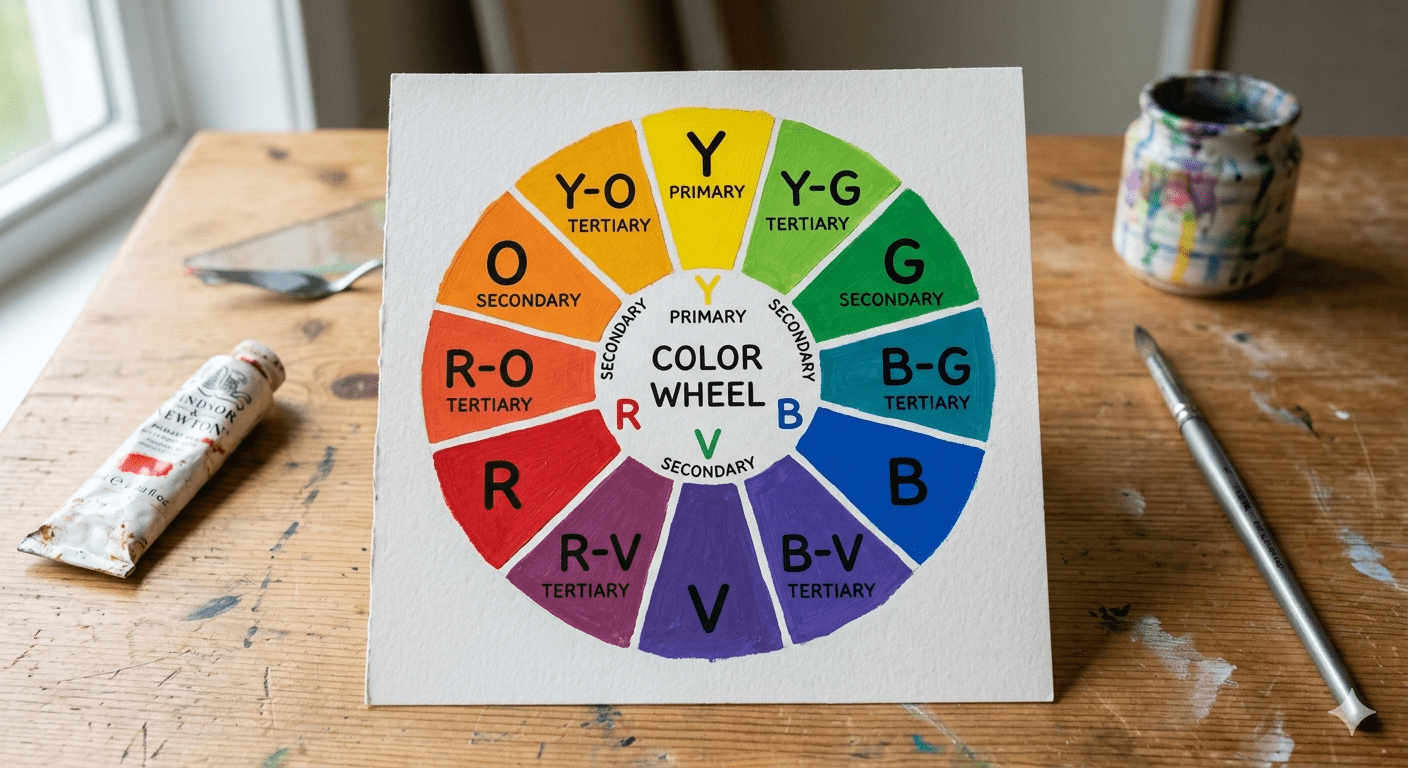
What do I do with the color wheel?
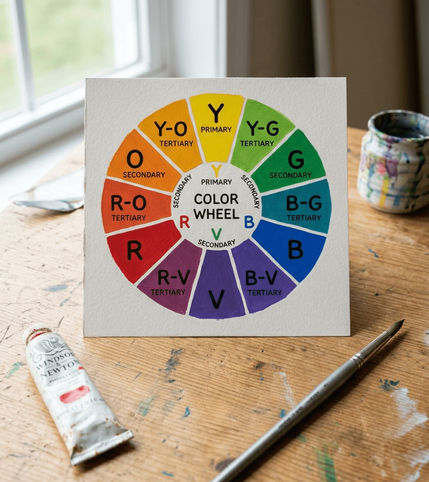
For the purposes of this post, we will be sticking to additive color theory and the Roy G. Biv color wheel that you learned in elementary school. So, the color wheel is your starting point. It organizes colors by their relationships to each other:
- Primary colors: Red, yellow, and blue . Those are the ones you can’t make by mixing others (unless you’re fancy and that’s a whole other post)
- Secondary colors: Orange, green, and violet. Those are made by mixing two primaries, just like they taught you in school.
- Tertiary colors: The in-between shades, like red-orange or blue-green that you get when you don’t mix even amounts of your primary colors.
Designers use the color wheel to create color harmonies. Those are the combinations of colors that are visually pleasing (because math).
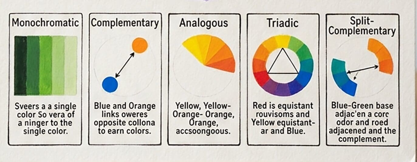
Can you explain that whole color harmony thing?
Color harmonies and super useful for building your brand. Here are the most common harmonies and what they create:
- Complementary: Two colors directly opposite on the wheel (e.g., purple and yellow). High contrast, energetic, eye-catching. Great for brands that want to stand out boldly.
- Analogous: Three or more colors that sit next to each other (e.g., blue, teal, green). Harmonious, calm, cohesive. Great for wellness, nature, and lifestyle brands.
- Triadic: Three colors equally spaced on the wheel. Vibrant and dynamic without the tension of complementary. Playful brands love this one.
- Split-complementary: One color plus the two colors on either side of its complement. More nuanced than straight complementary, but still with great visual interest.
- Monochromatic: One color in multiple shades and tints. Sophisticated, clean, intentional. Luxury brands often go this route.
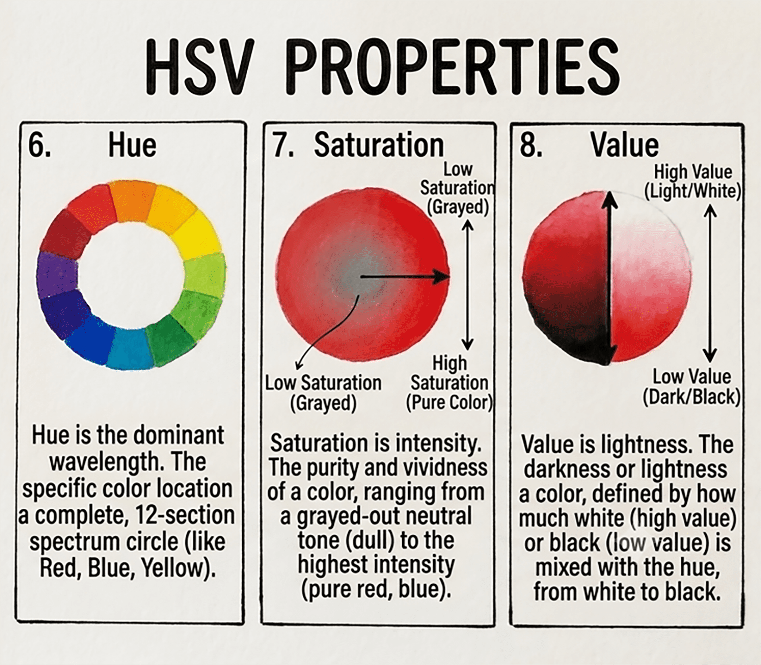
What is a color property?
Every color has three properties that can completely change the vibe:
- Hue: That’s the basic color you picked (like red, blue, or green).
- Saturation: That’s how intense or muted it is. High saturation is vivid and energetic, while low saturation reads as soft and understated.
- Value (or brightness): Basically just how light or dark the color is. Light colors will feel airy and approachable, while dark colors give authoritative and premium.
That means that if two brands both use “blue” they can still feel completely different. That’s because one could use a bright, saturated cobalt and the other a deep, desaturated navy. It’s the same hue with a completely different emotional effect.
Got questions? I’ve got answers. Shoot me an email at the link below.

Let's Chat | Let's Chat | Let's Chat | Let's Chat | Let's Chat | Let's Chat | Let's Chat | Let's Chat | Let's Chat | Let's Chat | Let's Chat | Let's Chat | Let's Chat | Let's Chat | Let's Chat | Let's Chat | Let's Chat | Let's Chat | Let's Chat | Let's Chat |
Facebook
Instagram
TikTok