

Creative Current
The
So how do I choose brand pallet?
This is the practical part. Let’s look at how to choose your brand colors, and how to get that palette to tell the story you want.
Start with personality, not your preference.
The biggest mistake people make is choosing colors they personally love. These colors aren’t a reflection of your taste. They’re a communication tool for your audience. So start by defining your brand personality. What are the three to five words that describe how you want people to feel when they interact with your brand? Bold? Trustworthy? Playful? Premium? Warm? Approachable? Those words are your color brief.
Research your industry and decide how to relate to it.
Look at the colors your competitors are using. It’ll tell you two things: what signals your audience already associates with your industry (good to know), and where there’s a visual gap you could occupy (even better). You don’t have to go against industry norms entirely. But you should make a conscious choice and not accidentally blend in because you didn’t look around first.
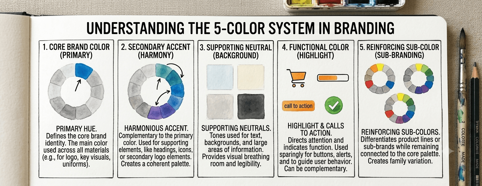
Build yourself a 5-color system, not just one color.
“My brand color is teal” is not a brand palette. If you’ve already signed up for my Brand Glow-Up, you know that a functional brand palette has five roles:
- Primary — Your hero color. The one that shows up most and is most “you.”
- Secondary — Complements your primary. Used for accents, CTAs, and supporting elements.
- Neutral dark — Usually a very dark tone used for body text and grounding.
- Neutral light — Used for backgrounds, white space, and breathing room.
- Pop/accent — Your wildcard. Used sparingly for maximum impact — a highlight color that makes people stop.
Test your colors!
Colors look different on your computer screen than they do when you print them out. I recommend working in CMYK to avoid a striking difference between your digital and online assets. Those colors are also going to look different in large blocks and. small text. Background color can also make a big difference. How do the colors look on white backgrounds vs. a dark one? Before you commit to your palette, you need to test it. If you’re still guessing, the Color Palette Studio has a product called the Color Pallete Fixer that helps fix your broken palettes. Or, you can hire a branding specialist to help you out (hint hint).
That mean that you check the contrast ratios of your text colors against your backgrounds, It’s not just for aesthetics, it’s the key to accessibility. Color that’s illegible to people with visual impairments isn’t just a design problem, it’s a values problem.
Define your rules and stick with it.
The palette is only as powerful as its consistency. Once you’ve chosen your colors, document the exact hex codes (for digital), RGB values, and CMYK values (for print). Pantone colors are also great, as they are consistent across mediums. Then you need to use your color palette everywhere, every time, and without exception. That is what a brand guidelines document is for, and it’s one of the most underrated tools a small business can have.
Small plug for my Brand Glow-Up freebie which consists of an email a day for 5 days to help you make brand decisions (including brand colors) and come out with a mini brand brief at the end. If you have any questions, or if you’d like to schedule a discovery session, visit my contact page.


Let's Chat | Let's Chat | Let's Chat | Let's Chat | Let's Chat | Let's Chat | Let's Chat | Let's Chat | Let's Chat | Let's Chat | Let's Chat | Let's Chat | Let's Chat | Let's Chat | Let's Chat | Let's Chat | Let's Chat | Let's Chat | Let's Chat | Let's Chat |
Facebook
Instagram
TikTok