Creative Current
The

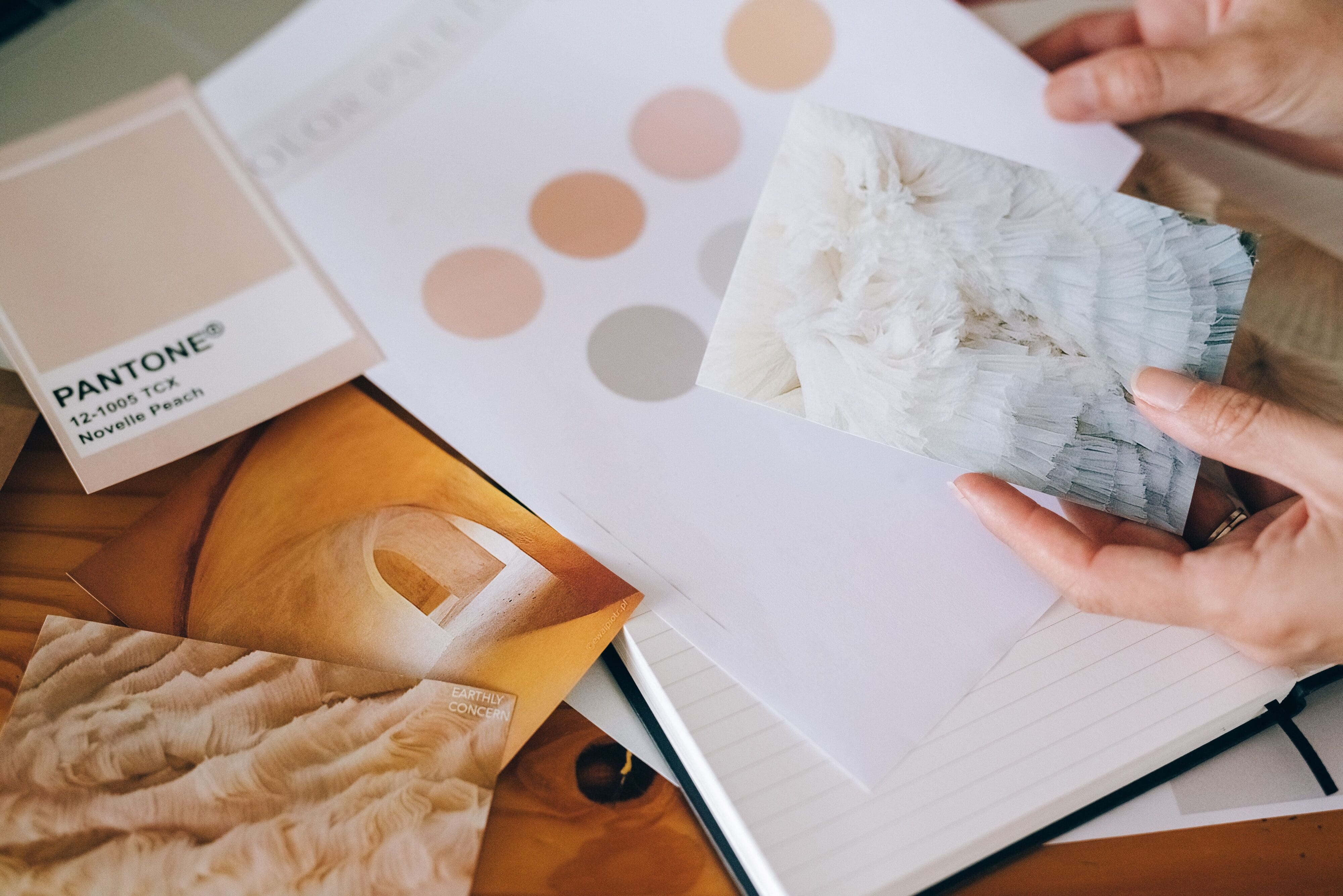
What is Color Psychology?
In this section, we’re gonna’ take a look at what colors actually say. Color psychology is the science that shows us how colors affect our human behavior and emotion. Yes, really. Different colors evoke different responses in most people. But (pay attention here), those associations aren’t universal. They’re going to vary by culture, personal experience, industry, and context.
That said, in Western consumer markets (that’s probably you), we can see patterns that are consistent enough to be useful. If you’re interested in learning more about color psychology, I highly recommend the book Pantone’s Guide to Communicating with Color. It’s out of print, but if you can usually find a copy at a decent price on AbeBooks. Until then, here’s a quick reference:
How Colors Make You Feel:
| Color | How it Makes Us Feels | Brand Examples |
| Red | Urgency, passion, energy, appetite, boldness | Coca-Cola, Netflix, Target |
| Orange | Warmth, optimism, creativity, friendliness | Fanta, Etsy, Harley-Davidson |
| Yellow | Happiness, clarity, warmth, attention-grabbing | McDonald’s, IKEA, Snapchat |
| Green | Nature, health, growth, trust, calm | Whole Foods, Spotify, Animal Planet |
| Blue | Trust, dependability, calm, authority, loyalty | Facebook, PayPal, Samsung |
| Purple | Creativity, luxury, spirituality, imagination | Cadbury, Hallmark, Crown Royal |
| Black | Sophistication, luxury, power, elegance | Chanel, Apple, Nike |
| White | Cleanliness, simplicity, purity, space | Apple, Tesla, Dove |
| Pink | Femininity, playfulness, romance, warmth | Barbie, Victoria’s Secret, Glossier |
A few things worth noting from that table:
- Blue is by far the most common corporate color. That’s because trust and dependability are universally valued in business. And it’s also why it feels super generic in crowded markets.
- Red is powerful color but it’s pretty overwhelming in large doses. That’s why most brands use it as an accent, for things like CTAs. However, it can be a great primary brand color if urgency or passion is at the core to what you do.
- Purple is extremely underused in small business branding. (That’s one reason I chose to add it to my color palette.) And it’s rarity means purple has more stopping power than most other colors right now.
And Remember Kids
To sum it up, the best brand color isn’t the one that represents your industry. It’s the one that represents your brand personality within your industry and makes you stand out from everyone else doing the same thing.
Got Questions? Give me a shout!

Let's Chat | Let's Chat | Let's Chat | Let's Chat | Let's Chat | Let's Chat | Let's Chat | Let's Chat | Let's Chat | Let's Chat | Let's Chat | Let's Chat | Let's Chat | Let's Chat | Let's Chat | Let's Chat | Let's Chat | Let's Chat | Let's Chat | Let's Chat |
Facebook
Instagram
TikTok