Creative Current
The
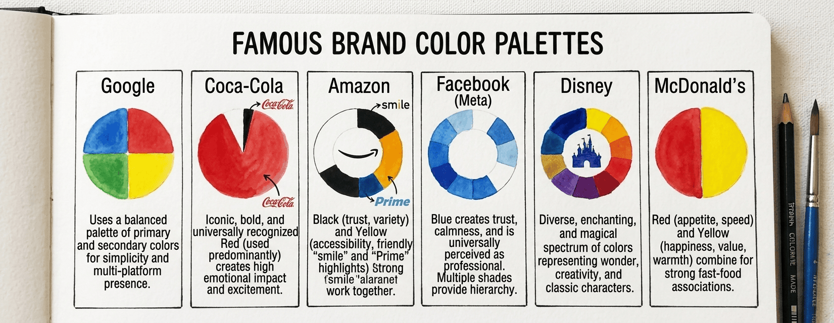
Color theory isn’t just aesthetics.
In branding, color theory is a strategic business tool. Here’s exactly why:
Instant Recognition
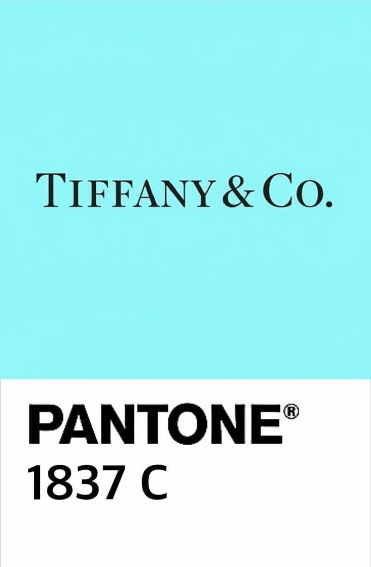
Studies suggest that color increases brand recognition by up to 80%. So think about it: you can identify a Tiffany box from across a room before you read a single word. That’s color doing its job so well that the color itself becomes the brand. Fun fact: Tiffany Blue is Pantone 1837, named after the year the company was founded
The goal isn’t necessarily to own a color entirely (very few brands can). The goal is to use your colors so consistently that your audience starts to connect those colors with you automatically, whether it’s on your website, social media, packaging, emails, or anything else.
Emotional Tone
Your brand colors set the emotional tone before your copy even has a chance to communicate. Before someone reads your headline, your colors have already told them whether you’re serious, playful, luxury, accessible, bold, or soft. And if those colors are sending the wrong message (or no clear message at all) you’re fighting your own brand every time you show up. That means your words have to work twice as hard to overcome what your colors are already saying.
Trust thru Consistency
Inconsistent color use is one of the most common (and damaging) brand mistakes I see. A brand that’s using twelve different shades of “blue” across its materials looks like it doesn’t have its act together. That’s even if what they’re selling is excellent. Consistent color use signals your intentionality and professionalism. And it signals that you care about the details, which, in the mind of a potential client, suggests you’ll care about the details of their project too.
Differentiation
If you look at the top ten brands in just about any industry, pay attention to their color choices. You’ll usually find a pattern. Every financial services company is blue, every wellness brand is sage green, and every law firm is navy and gold.
That pattern is both a comfort (because industry norms signal trust) and an it’s an opportunity. That’s because the brand that chooses something bold and intentionally different in that sea of identical colors. Then the brand becomes instantly more memorable without having to change a single word of their messaging.
Color differentiation is one of the lowest-cost, highest-impact brand decisions you can make. You don’t need a bigger budget. You need a braver palette.
Have Questions? I have answers. Follow the link to send me a message.

Let's Chat | Let's Chat | Let's Chat | Let's Chat | Let's Chat | Let's Chat | Let's Chat | Let's Chat | Let's Chat | Let's Chat | Let's Chat | Let's Chat | Let's Chat | Let's Chat | Let's Chat | Let's Chat | Let's Chat | Let's Chat | Let's Chat | Let's Chat |
Facebook
Instagram
TikTok